A Message for Tokyo International Mini-Print Triennial 2005
The Tokyo International Mini-Print Triennial, started in 1995 to celebrate the 60th anniversary of the foundation of Tama Art University, has marked its 4th exhibition. As a commemorative event to celebrate the 70th anniversary, the 4th exhibition will not only show about 1,800 prints, including selected and awarded pieces from the past 3 triennials, from 81 countries/regions of the world, but also look back on the activity for the past 10 years.
I hope that while today, while homogenization is proceeding in every field, this exhibition has successfully presented a chance to think about global issues, such as internationality provided with regionality, by showing together works given the characteristics of each country or region.
In addition, the exhibition was made possible through the fusion of low and high techniques: the open competition, for which the entries are ubmitted by ordinary mail using the characteristics of print art, and the scholaric data open to the public through the web site. I am sure that the fusion has given rise to a new dimension for the future development of art.
We shall be happy if you see a number of unique works, and experience the artists' refreshing sensitivity and serious attitude to artistic creation.
We would like to extend our deep appreciation to the artists, who agreed with the objective of this exhibition and to exhibit their works, and to the concerned organizations and people for their support and cooperation in making the triennial possible.
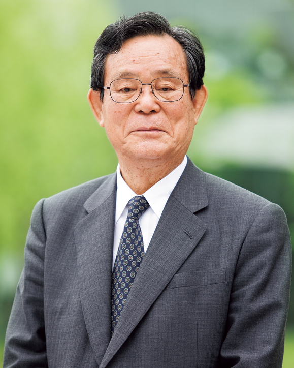
FUJITANI Nobuto
Chairman of Board of Directors,
Tama Art University
Greeting
Organized by Tama Art University and started in 1995, the Tokyo International Mini-Print Triennial marked the 4th exhibition as a commemorative event to celebrate the 70th anniversary of the founding of the University. It is a great honor for the executive committee of the triennial that we received as many as 1,105 entries from 81 countries and regions.
Particularly, the 4th exhibition, an invitational competition mainly for selected artists from the past triennials, marked an internationally high standard of the entries. Through the exhibition, we can definitely recognize the prospering print art scene of the world. A number of works with various viewpoints of art, presented by each artist, have made this exhibition significant toward the future situation of the world we live in.
Today sees the rapid development of science technology, and the diversification of values. Accordingly, the artistic expressions have also become varied. We can say that among various art media, print art is an artistic manner open to the future in the sense that the general technical evolution will surely bring out new expressions of the genre.
The past and current Triennials have demonstrated that print art is a prominent expressive medium of art beyond places and languages, which can bear the fruit of international exchanges. I hope that appreciation of the entries will deepen even more the conversation of people from the world and promote understanding and friendship among them.
We would like to extend our deep appreciation to the many artists who exhibited their works and other people concerned, including jurors and the administrative staff, for their cooperation and support in making this exhibition possible.
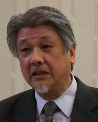
TAKAHASHI Shiro
Chairman of the Executive Committee /
President of Tama Art University
Jury’s comment
Examining the entries for the Mini-Print Triennial, which is a second-time experience for me, I often thought that the origin of print art is recognized exactly in the fact that you can see a print closely in your hand, thanks to its smallness. Now, I remember participating in the international-scale ymposium “ISPA japan” as a panelist to summarize the arguments, held for three days at Tokyo National University of Fine Arts and Music at the end of 2004. I exposed myself to various reports on current situations of print art or proposals for it, etc., and got bored with the atmosphere of “a sense of crisis” flowing like a thorough bass. For me, who went through the experience, the mini-prints in great numbers, deep inside in the microcosm without any loud voice, were nothing else but a healing.
Such kind of a sense of crisis around contemporary print art is nothing new. Someone necessarily talks about it half neurotically -- as if to do so is the only evidence of intelligence -- when “new expressive media of art” make their appearance. If talking about such a crisis of print art as an expressive medium, the same is true of other media like painting and sculpture. Actually, if doing so about print art, we rather should first argue about the crisis of the whole field of art. I do not mean that exchanging opinions about the general situation of print art at public opportunities is not significant. But, however often we may repeat arguments, or sometimes, may use the argumental logic such as “deus ex machina,” the proposition “what print art is” is only a matter of each maker and viewer. We should look more straight at this unquestionable fact.
Print art means to me everything generated by transferring or compressing an image (or, the original plate). The transference or compression has something to do with both the meaning and material of print art, forming the basic for its microcosmic nature. In this connection, the grand-prix piece by Slovakian artist Katarina VAVROVA impressed me with just a compression containing a profound meaning related to a complicated and inscrutable region with somehow an Eastern history; the vision of the semi grand-prix piece by SANPEI Mitsuo, with special attention to a black monochrome, stood out with its powerful presence of the very material.
Speaking of the presence of material, the example by YAMASHITA Mamiko (jury award), just as if transferring and compressing the jet-black, endlessly complicated “time,” caught our eyes with its solid mati*re. But what is more refreshing to me in this work was its stubborn attitude, never fawning on viewers. I wonder that the same can be true of TAKINO Hisako's somewhat humorous example (jury award), exploring her artistic path with an unconcerned attitude. These examples press us to recognize again that print art is first a microcosm with the maker placed in its core (let us remember rooms of print art at major museums of art). And, I think at least that the task submitted to us is the most significant achievement of the Mini-Print Triennials.
What is print art? For me, as a print artist, that is a question that I am always thinking about. I am afraid that in such a time as this, flooded with printed matter, unless we find a ground for insisting that this is a print, and not usual printed matter, we will lose the reason that we continue printmaking activity. Thus, I would like to start this brief text by bringing up my opinion that an ukiyo-e print is not “hanga.”
It is said that Kanae Yamamoto (1882-1946) and others, who started the Sosaku-hanga movement, were the first to use the word “hanga.” They applied the word to printed art created with a production system different from that of ukiyo-e. Ukiyo-e was a product of division of labor by plural artisans -- a publisher commissioned an ukiyo-e designer, a carver and printer made the ukiyo-e based on the design, and then the publisher sold the product on market. The word “hanga” was originally expected to be used in reference to something different from the traditional ukiyo-e by putting the process into an individual dimension. But, since the Japanese word “hanga” was very appropriate as a name exactly for “simply printed matter” or ”full-color matter,” it was applied to nishiki-e (full-color woodblock). Actually, our senior print artists, who underwent the baptism of European modern painting, declared that a print, as totally a personal expressive medium, will not be completed without going through the process in which they get an image they like, prepare the plate for printing, and transfer the image onto a sheet. In this way, they started to develop a new print movement called “Sosaku-hanga.”
Western modern painting, as a personal expressive medium, started at a point of time when oil painting, run off the authority of church or royalty, was no longer wanted by them. I suppose that just like modern painting, the Sosaku-hang movement, too, started ironically at a point of time when woodblock prints, copper prints, or later lithography had no more use for society, in spite that these media once had shouldered responsibility for a printing revolution, changed society, and made a contribution to development of the community.
I can confidently say that to believe that “what was no longer wanted” will actually contain something precious leading to a humanistic element should be our basic attitude for art.
Thinking of the fact that print artists obtained an expressive freedom because those print media were no longer wanted, we can liberate ourselves from the press machine, and should realize again that we humans are animals who have two eyes, departing from a camera-wise outlook of the world: to turn our back on the current progress of technology is even a possible important choice as a proper attitude for print-making.
Based on those ideas, I judged the entries for this triennial exhibition. I selected two pieces by Veronique DENIEUIL (France), SHIMIZU Masahisa (Japan) as jury awards, recognizing their simple feel of handwork and an opposite air against the contemporary mass-production and speed-first society.
The message of a piece cannot fully persuade and move man's mind without aformative quality. I judged entries by valuing the maker's message, and then considering how rich the content of the message is materialized into a formative quality.
I noticed in the jurying-process that pieces even though dealing with topical social subjects of today failed to win an award because of formative problems. And I admit that I could not but rate a couple of pieces as a single piece according to the prescription of this competition, and that I could not read Arabic enough because of my insufficient knowledge of the language.
Various techniques of print expression have long been uniquely developed by artists, and today, they have extended to the digital realm. Then, it is regrettable that I could not find CG works among the awarded pieces. In this connection, I placed a high value on “MOMENT” by Sirje EELMA (Estonia) who displayed an aggressive attitude to develop a new technique for print. The motif of “EXCURSION” by Walter JULE (Canada) is invisible forces,such as gravity and tension. The atmospheric pressure or gravity, discovered by human beings in the modern age of science, have an absolute influence on man but are not sensed at all in daily life. I believe that they must be a subject matter for artists in this space age to recognize again.
The grand-prix piece “200 YEARS A.BORN H.CH. ANDERSEN I” by Katarina VAVROVA (Slovakia) has created a literary picture plane, enriched with Eastern sceneries and human figures. This print artist from Slovakia, located halfway between Turkey and Denmark, represented a Turkish illusion which the writer of children's stories tells to exhibit the work at this triennial exhibition held in Far Eastern Japan. I think that in this respect, the expression of East-West cultural exchanges deserves the best award.
“TAMAYURA 205” by SANPEI Mitsuo (Japan), a prominent piece peculiar to print art with an obviously practiced manner, won no more than the semi grand-prix. My voting may have influenced the result, because I did not have ufficient experience in judging prints.
I enjoyed judging very much where I could see numerous prints from all over the world. I appreciate it.
The current mini-print triennial is an invitational competition for selected and awarded artists from the past 3 triennials; therefore, the quality of the entries were naturally quite high. Since we jurors were divided in our views in selecting award pieces, we had to repeat the voting again and again. I could say that the jurying, that much more, was worth doing.
In tableau, the idea of mini-size is apt to be regarded as a derivative or a personal taste. But in print art, the size can present an individual attractive expression of small space that a large-size work can never realize. Clearly demonstrated in the brushstroke of Abstract Expressionism, tableau is naturally required for a bodily scale, but the expression in which print intervenes between the body and the picture plane can develop a deep, condensed palm-size world of its own. I would dare to say that the Triennial Exhibitions realized by the system of mail may owe to the introduction of the extremely explicit “modernistic manner,” granted that there were the matters of expenditure or time and effort.
Now, let me make some comments about the awarded works. The grand-prix piece by Katarina VAVROVA (Slovakia) depicts a minute image of dense fantasy. Or, the image may be a scene of a specific story, but it is fascinating and mysterious enough to invite viewers to an older time or an exotic land. This piece, though small, lets us feel a rich spatiality, as shown in the contrast between the picture and the blank, and the treatment of the layered depth.
SANPEI Mitsuo, winner of semi grand-prix, is somehow an unbridled and peculiar
print artist. I found it interesting that with, in a sense, the odd large-oval shape in its central part, its compositional imbalance is actually connected to an insolent sense of humor. I was also attracted by the children's picture-like charming lines.
The jury award piece by Robert BARAMOV (Bulgaria) shows a surface unifying a symbolic motif and a surrealistic illusion, and a technically high-level quality. In addition, an allegorical space is created there, containing a kind of absurdity due to the arrangement of light and shade and the effects of uneasy colors.
Another jury award piece by KIM Jong Ryeol presents a picture plane containing an unusual tension in which smoky, indefinite shapes are drifting on a jet-black earth. Though the sight could have been properly described as pastoral, the maker's interest, I wonder, is rather taken into a conceptual manipulation to produce “a space as a phenomenon” with the use of a technique of print. I also noticed the tactile, thick mati*re of the ground.
The jetliner and print are similar in that they travel around the world (says art historian TAKASHINA Shuji): I enjoyed jurying the entries for this triennial exhibition, as if I had traveled around the images of the world. I appreciate the “small art” (mini-print).
I just said “small art,” but “the grand art” must have been far poorer without this “small art.”
Words and images have continued to be two major media for information for long time, and images give concreteness to words. And yet, different from video art or photography, print art, provided with a nature of “formative expression,” is “the most avant-gardes” expressive medium that reveals the individuality of the tribal or personal imagination indigenous to each artist from different nations or regions. Thus, I thought I could say paradoxically that the world of“mini-print” keeps standing at the forefront of international exhibitions of art. I believe that the mini-print triennials are a fine project open to the world, one that should by all means be carried out as it was.
While judging the entries for the current triennial, necessarily possessing high quality, I noticed that the “small art” of the world has come near to the “painting” (the encounter between “print” and “painting” has a similar history to the encounter between Japan and the West). It could mean that the fusion of those two has already proceeded internationally.
Judging woodcuts, copper prints or mixed-media prints, I found not a few highly technical works from a viewpoint of formative expression, of which I could not tell the details of the technique.
The grand-prix piece by a Slovakian artist conveys to us a mysterious emotion of the people from the region that experienced the East European democratization: the work neither emphasizes lines (Western-art quality) nor denies color planes (Eastern-art quality), presenting an “apocalyptic” world in which both the lines and color planes are moderately fused. This grand-prix piece can have an artistic force to instill an image into viewers, even if not being informed of the motif of Andersen.
I have an image about Western prints in which everything is depicted with delicate lines only, and exactly shown in the case of copper prints, or, even in the case of woodcuts (for example, wood-engraving). To me, then, the semi grand-prix piece by a Japanese artist, too, was very refreshing. The piece, which killed “color” characteristic to the picture plane of Japanese prints like ukiyo-e, expresses an image of a momentary swaying. The stillness and a sense of color, nevertheless, are rich.
Rating high their formative expressions that can never leave “human-beings,” whatever subjects may be chosen, I selected two pieces by Viola TYCZ , Jean DUNCAN as jury award pieces: I thought that the work by the Polish artist TYCZ, which is so fathomlessly grave and deep as to lose my words of description, intends to be imperfect as a picture, but, at the same time, intends to be perfect as an artwork. The work by the Northern Irish artist DUNCAN, on the other hand, has a beautiful image acquired not through the rhythm by the contrast of colors or movement of lines, but through the unexpected employment of aesthetic images, such as air or water. It is essentially a joyful work.
Judging from the number and variety of the entries, the scale of the current triennial project can be compared to that of traveling art across the world.
Exhibition information
Tokyo International Mini-Print Triennial 2005
- Venue
- Tama Art University Museum
1-33-1 Ochiai, Tama-city, Tokyo, Japan - Date
- (Sun.)Nov. 2,2005 - (Sun.)Jan. 22,2006
- Open Hours
- 10:00 - 18:00 (last admission at 17:30)
- Closed
- Tuesdays
- Organized
- Tama Art University
- Under the auspices
- Ministry of Foreign Affairs of Japan
Agency for Cultural Affairs
Japan Foundation - Sponsored by
- The Alumni Association of Tama Art University
- Supported by
- Takashimaya Cultural Foundation
If there is any essential difference between print and painting, though making a sharp distinction between them may not be very important, I suppose that a special characteristic of print art is that it will be completed at the time of being compressed or fixed to a certain level when printed or pressed. On the other hand, painting (especially, oils), theoretically speaking, can leave a limitless room for addition or deletion, which, therefore, met modern artists' demands for excessive freedom or self-expansion; print art (and photography) leaves a certain level unaltered or dares to do so, even if possible to alter the level, once a print is completed by the decisive intervention of external elements, such as print and an optical or electronical framing. This seems to be an exquisiteness of print art.
In the current art world, in which non-completeness, non-restrictiveness, or alteration of artwork is welcome, the heteronomous dimension (time, space, matter, or phase) beyond artists (or, creators) in print art could be evidence of supposition that print art is an inflexible, non-modern expressive medium. But, contrarily, that is because the very nature of print art (and photography) theoretically must be a potential to develop as a promising means for post-modernist art.
This is how I interpreted the reason that the grand-prix pieces, despite being apparently old-fashioned, let me feel an individual charm and freedom rarely given by oils. The work (unit of two pieces), which I guess must have been made for this year marking the bicentennial anniversary of the birth of Andersen, the Danish author of “picture books without pictures,” judging from the titles and pictorial content, is successful minute prints securing the unlimited, novelistic space of imagination with a mooring rope of lines and images. What I especially rated high is that these illustrations have never indulged in whimsical fantasy and lines. I think that they are filled with an open sense, released not from the possible freedom and alteration particular to oils but, contrarily, from a compressed moment of the time and space and expressive manner sensed in something like an icon laboriously carved on a glass surface, or from a fixed dimension like a fossil.
When compared with this grand-prix piece full of medieval light (which comes from the depth of the picture plane, contrary to the case of modern painting), the semi grand-prix piece is highly modern, and is like an oil. With the strong smell of the possibilities of addition, alteration, or expansion, the piece is actually filled with a modern and contemporary freedom. The work, if not a print but an oil painting, would have looked commonplace, but actually, it seems to have kept an artistic balance thanks to the technical inconvenience of print art.
The works by GOTO Fumiko and KOBAYASHI Takayuki (jury award winners), which seemed to be made by treating digital images with computer, looked the most remarkable to me. Both pieces drew my attention, not because their manner of using digital or computer media was refreshing to me, but because they have broken off the connection with the blind faith in freedom as experienced in oil, that is, the expression of aura of being a creator. Particularly, Goto, shows an unquestionably excellent treatment of icons penetrating multiple spaces, as if he had thrown off the icons (how polysemic, beautiful the image of“thrown off” is). Strangely, it seemed to me that those pieces using the latest media of art seem to have an unexpected affinity with the most medieval grand-prix piece. I wonder if that is because both pieces have worked the heteronomous nature, as if they left everything about the will to create to the certain level without any hesitation. Here, that open sense, an inevitable part of distinguished art, must have been released.